The Project

I managed all aspects of the project, from the initial user research and ideation to prototyping and user testing.

Duration: 1 month

Tools: Figma, Miro, Maze, Confluence
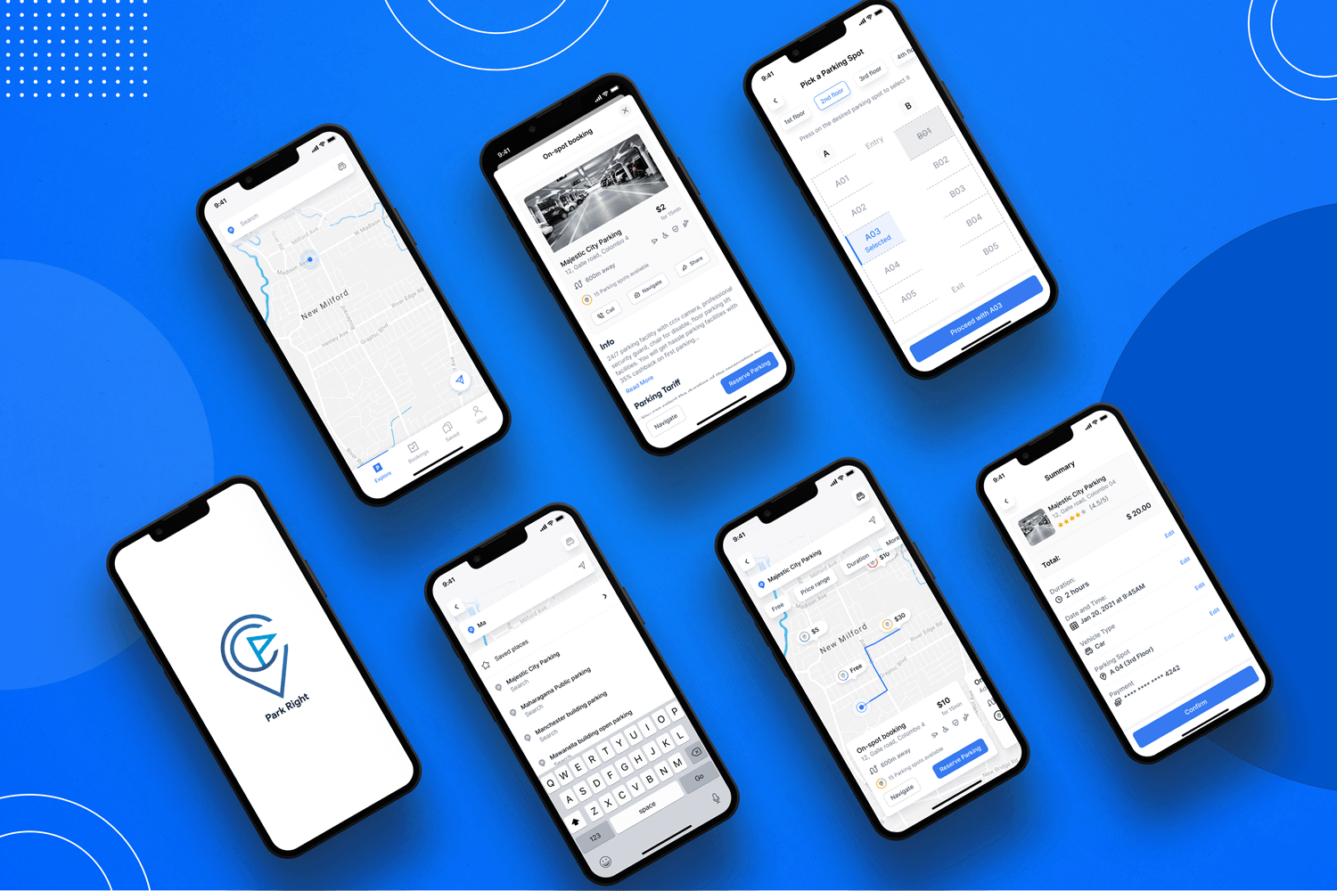
Context

The case study delves into the key pain points of the daily commuters in urban cities looking to park their vehicles and explores user-centered solutions that could help people book their parking spots, flexible to their requirements and at their convenience, without the hassle of finding one once they’ve reached the destination.

Speaking from personal experience, wrong parking in cities in busy occurs due to lack of parking space and it takes almost 20 to 35 minutes to find them. 

The endeavor to successfully tailor the experiences was driven by the intention of making people’s emotions like “ease” and “comfort” synonymous with the idea of taking their motorized vehicles out of their garages without any hesitation of loss of time finding a place to park in a safe and secure spot and make hassle-free payments at the toll gates.

The Challenges

  • Attracting users from all community levels of the city to benefit from the convenience of parking their vehicles without the hassle
  • Managing overcrowded situations in parking spaces by deploying streamlined use of technology for users
  • Helping users from losing precious time and money
  • Facilitating easier modes of payment, using relevant technology, for paying parking toll fees
  • To simplify the visual and functional aspects of the app.

Defining Key Pain-Points

  • For first-time users, unfamiliarity with the convenience of finding and reserving parking spots even before reaching the venue
  • No resonance with the experiences and habitual responses which people cognitively have towards using other existing need-based services like hailing a cab (like Uber) or making travel bookings (like Booking.com)
  • No control, flexibility, or transparency is given to the user’s basis of their requirements in real-time. Lack of clarity and constant support would lose the users’ trust and thus its credibility in the users’ eyes

User Research Phase

In order to identify the user behavioral patterns and psychographic profiles – i.e., their needs, pain points, and motivations – a few hours were taken to draft some open-ended and direct questions related to the topic and used them as a basis for in-person/telephonic conversations with few of the people I have known/collaborated while living in Sri Lanka, and who were also willing to share their experiences during an interview-like session.

Purpose of User Interview:

  • Understand the end-to-end steps of the customer with respect to the platform
  • Identifying customer touch points in the journey
  • Identifying pain points
  • What they expect from the end user

Interview Questions to Users:

  • Do you own a car or a bike? If yes, how frequently do you use it as a mode of conveyance?
  • Do you prefer driving your vehicle or using public transportation/ride-sharing services? Why so (in either case)?
  • Do you plan your travel every day before leaving home? Either way, how does that affect your daily schedule?
  • Does your office/places your regularly visit have parking spaces? If not, how do you end up parking your vehicle?
  • Do you like having a reserved parking spot for places you regularly visit?
  • How much time on average do you end up spending, finding a parking space?
  • How much do you ideally spend on parking vehicles?
  • How do you check for tariffs or pricing slabs for the parking time in these parking lots?
  • For regular travel and parking in the same space, would you prefer a subscription to save your spending on parking?
  • How do you manage the parking receipts after making the payment?

Empathy Maps

Observations from the key insights were noted down on sticky notes and color-coded until it collectively gave out enough data points to articulate what we know about a particular type of user, which would affect the design decisions I took.

By having the four-quadrant, namely “Says”, “Thinks”, “Feel” and “Does”, exhibiting the different behavioral and psychographic states of the user when encountered with a given vehicular parking situation, the intentions of this exercise were to:

  • Remove bias from my designs and align myself with the true nature of understanding the user/s
  • Uncover user needs that the user themselves might not even be well aware of
  • Understand what drives users’ behaviors
  • Provision of guidance toward meaningful innovation

User Personas

While elaborating on the types of users accounted for who would be using the platform, two predominant user groups had been identified during my research phase:

  • Young Professionals” — People who are employed in a profession or white-collar occupation at a young, working age. They usually have little familial responsibilities to shoulder and are able to take some time out for themselves; and
  • Family Driven People” — People who are managing personal and professional lives in equal measure, as a large contribution of their time and effort goes into taking care of a small/big family (i.e, with elderly people, children, husband/wife)
Based on the exercises done above, two Personas were crafted. These personas served to inform the design decisions during the initial phase of design & research.

Customer Journey Maps

Taking the key persona (Jeromy’s) behavior, goals, needs, and motivations into account, the follow-up on the thought process was laid out in stages and against which, every interaction touch point, the user’s emotional and psychological state, and product opportunities were plotted.


Design Phase

Sketches

After having gained an architectural understanding of the hierarchy of elements that will flow into one another, some solutions which the users could benefit from were fleshed out. A brainstorming activity like sketching out low-fidelity ideas on paper helped me to visualize multiple routes to a single solution and eased the process of zeroing down on a couple of options to execute.

Hi-fi Mockups

UI Mockups

  • The interface should have a clean and minimal look. (One of the biggest bones of contentions amongst our users was that they were greeted with a barrage of information whenever they visited the few existing platforms and this was too much to take in)
  • The interaction between various elements in the interface should be seamless and quick to uptake
  • The platform should be easy to navigate with proper visual cues that make even a first-time user feel at ease

Problem #1:

For first-time users, unfamiliarity with the convenience of finding and reserving parking spots even before reaching the venue

Solution: 

While some of the users may have an idea if they used other online car parking platforms, the goal is to walk them through the first-time process (as seen above), while using easy humanizing language to communicate and drive the attention of the audience towards their first step

Problem #2:

No resonance with the experiences and habitual responses which people cognitively have towards using other existing need-based services like hailing a cab (like Uber) or making travel bookings (like Booking.com)

Solution: 

Taking a cue from Jakob’s Law (a defining UX law that states users prefer your product to work the same way as all the other sites they already know), I have mimicked a similar search destination interaction, while maintaining the design language created for this app

Problem #3:

No control, flexibility, and transparency given to the user’s basis their requirements in real-time. Lack of clarity and constant support would lose the users’ trust and thus its credibility in the users’ eyes

Solution 1

Important filters like arriving time, duration of booking, and price range were brought to the fore (and not buried inside the filters option) to provide users control over their search and help them see the availability and exact prices get reflected dynamically

  • The abridged look and necessary options of the app (as seen above) lure the user and grant them to handle it more and often the frolic way assuring Aesthetic-Usability
  • In accordance with Miller’s Law (i.e., an average person can only keep 7 (plus or minus 2) items in their working memory), chunking of information on a white card proved to be an effective method of presenting groups of content in a manageable way
  • Color stabs deep into the heart. I have given a plain white background and the icons are represented in specific colors for each category type of booking
  • Lastly, following Fitts’s Law of making elements larger with clear positioning to make them easily selectable, the main CTAs (“Navigate” or “Reserve”) on the info card and the price tag were consciously large with sharper colors.

Solution 2

The descriptive card view captured all the necessary information in a nutshell for the user to quickly scan through the important takeaways. Mirroring the different toll-tariff structures in parking spots on weekdays and weekends, the user is given the flexibility right on the app to view and change the duration for which they’ll have their vehicle parked at the destination, basis the costs.

Solution 3

Mimicking the real-life pattern of how users are familiar with reaching the parking space and then finding the right spot to park their vehicle, I have sketched a schematic representation of an actual parking lot with the option for the user to pick and select the desired spot while avoiding the situation to make an on-spot decision after having reached the destination.

Takeaways

Keep Empathising

Empathy is one of the core elements of the design framework. Spend as much time as you could to understand the user’s perspective and the context in and out.

Sketch and Stretch Ideas

Instead of speculating possibilities in your head and jumping straight to rendering digitized screens, you have to start putting things down on paper trying and testing the smallest of brainwaves till it takes the shape of something viable and effective

Avoid the Guessing Game

There is always a tendency to get started with the solutions after hearing about the design challenges which lead to faulty design outcomes. Try to guess less and focus more on the user, and business aspects to better form the actual design challenges.