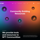
In today’s digital landscape, a user-friendly website is no longer a luxury, it’s a necessity. To capture attention and keep visitors engaged, prioritize a seamless user experience (UX). Here are 10 tips to create a website that delights users, incorporating the latest UI/UX trends:
1. Prioritize Clarity & Content Hierarchy (Image: Pyramid with “Content” at the top, descending levels for “Sections,” “Subsections,” and “Elements”)
Imagine an e-commerce website selling shoes. The main content area (pyramid peak) would showcase featured shoe collections. Subsections (lower pyramid levels) could be for men’s, women’s, and kid’s shoes, with further breakdowns by category (boots, sneakers, sandals).
Key takeaways :
- Organize content logically using a clear hierarchy.
- Guide users with visual cues like size, color, and spacing.
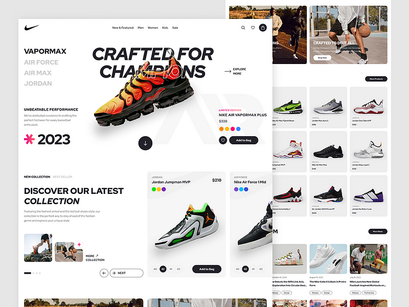
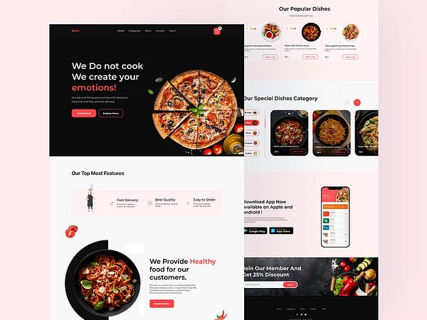
2. Embrace Minimalism (Image: Sleek website homepage with clean layout and limited elements)
A law firm website might have a clean homepage with a hero image showcasing a their team or their Senior Lawyer and the firm’s logo. Navigation would be simple, with clear buttons for “Practice Areas,” “About Us,” and “Contact.”
Key takeaways :
- Focus on essential information and functionality.
- White space is your friend — it enhances readability and avoids clutter.
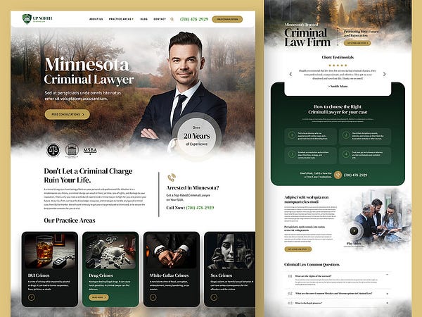
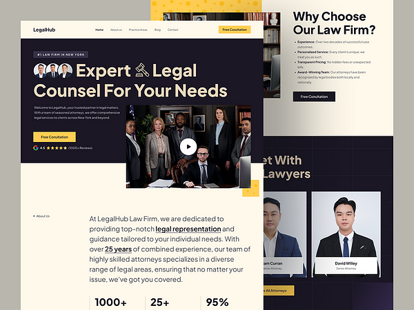
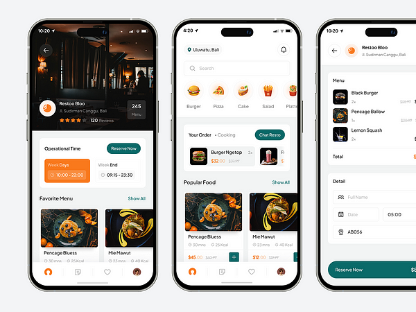
3. Master Mobile-First Design (Image: Split-screen showcasing a website adapting perfectly to mobile and desktop views)
A restaurant website should display the full menu with clear descriptions and pricing on both desktop and mobile screens. Images of dishes should resize seamlessly for optimal viewing on any device.
Key takeaways :
- Over 50% of web traffic comes from mobile devices.
- Design a website that looks and functions flawlessly on all screen sizes.
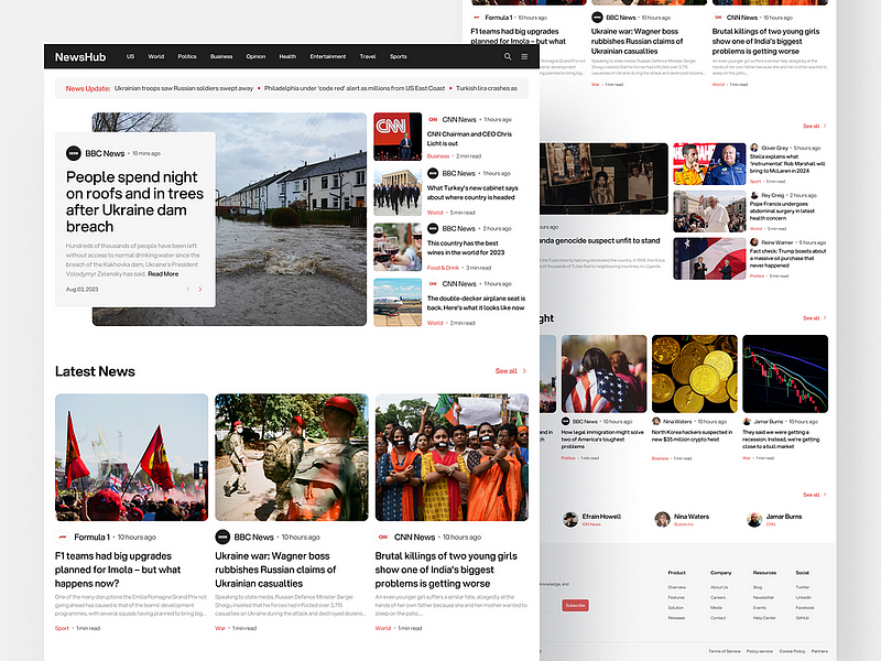
4. Navigation Nirvana (Image: Simple website navigation bar with clear labels for each category)
An online news website could have a top navigation bar with clear labels like “World,” “Business,” “Technology,” and “Entertainment.” Submenus could dropdown for specific categories within each section.
Key takeaways :
- Make navigation intuitive and effortless.
- Use clear labels and a consistent structure across all pages.
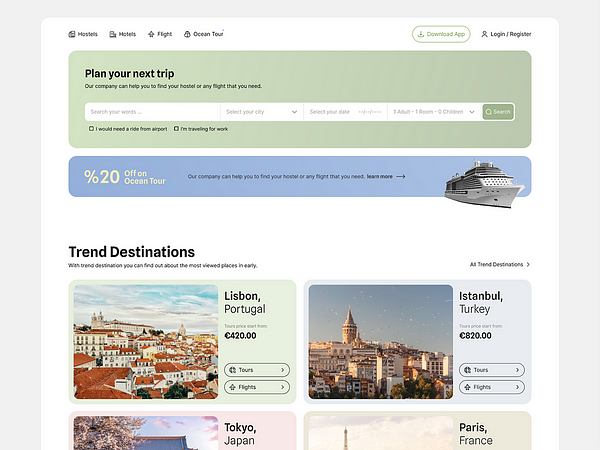
5. Leverage the Power of Search (Image: Magnifying glass icon on a website search bar)
A travel booking website should have a prominent search bar allowing users to search for destinations by date, price range, and travel style. Autosuggest features can further refine searches.
Key takeaways :
- Implement a robust search function for easy information retrieval.
- Users should be able to find what they need quickly and efficiently.
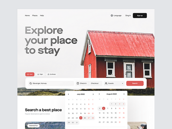
6. Visual Storytelling (Image: High-quality hero image showcasing a product or service)
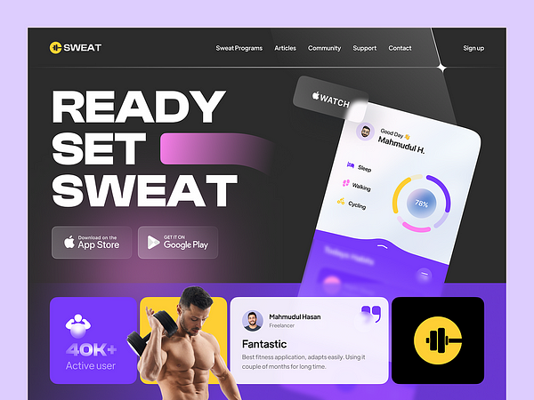
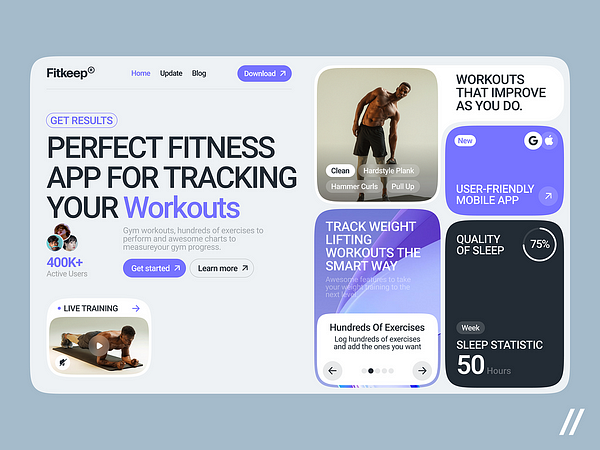
A fitness app website could use high-quality video showcasing people using the app to achieve their fitness goals. Images of healthy meals and workout routines can further engage users.
Key takeaways :
- Compelling visuals capture attention and enhance understanding.
- Use high-quality images, videos, and illustrations strategically.
7. Embrace Accessibility (Image: Person using a screen reader on a laptop)
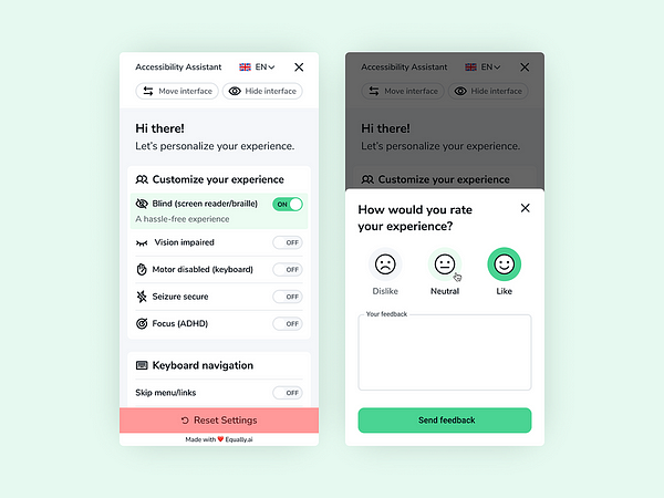
Ensure all website text has sufficient color contrast against the background for easy reading. Images should have descriptive alt text for users who rely on screen readers. Keyboard navigation should allow users to access all functionalities without relying on a mouse.
Key takeaways :
- Ensure your website is accessible to everyone, including users with disabilities.
- Use proper color contrast, alt text for images, and keyboard navigation.
8. Speak Their Language (Image: Globe icon with multiple language options)
An e-commerce website selling clothing could offer a language toggle button to switch between English, Spanish, French, and other languages. Ensure translated product descriptions and size charts are accurate.
Key takeaways :
- Cater to a global audience by offering multilingual options.
- Ensure translated content is accurate and culturally appropriate.

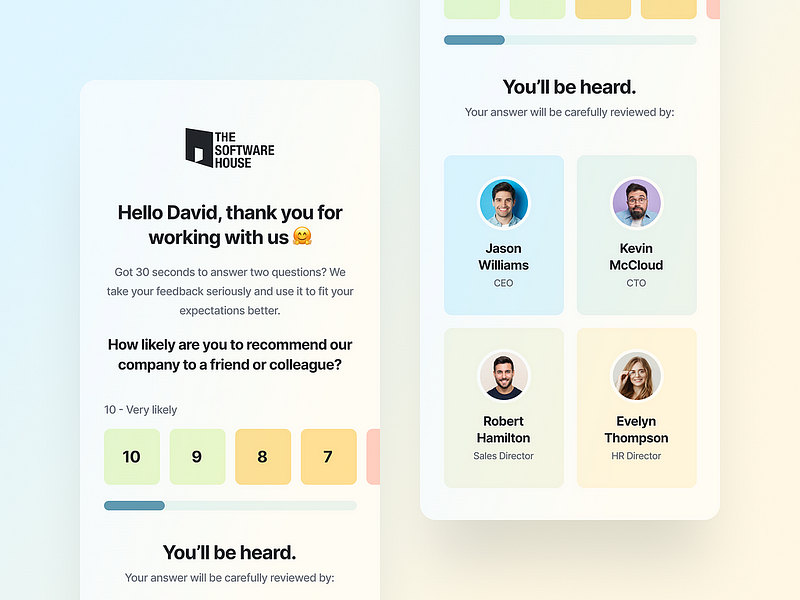
9. The Power of Feedback (Image: Pop-up survey box on a website)
Include a short pop-up survey after users complete a purchase on an e-commerce website. Ask for feedback on the shopping experience and offer an incentive (discount code) for participation.
Key takeaways :
- Gather user feedback through surveys, polls, and analytics.
- Use insights to continuously improve your website’s usability.
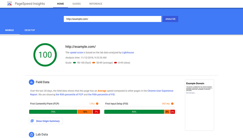
10. Speed is King (Image: Website loading bar with a green checkmark)
Use image optimization tools to reduce file sizes without sacrificing quality. Consider a content delivery network (CDN) to improve website loading speeds globally.
Key takeaways :
- Optimize website performance for fast loading times.
- Impatient users won’t wait for slow websites.
By following these tips and incorporating the latest UI/UX trends, you can create a website that is not only aesthetically pleasing but also a joy to navigate. Remember, a user-friendly website translates to happy visitors, increased engagement, and ultimately, success for your online presence.


